Brand identity · Logo design
FINETEXIAL.
The idea
An upward gesture.
A grounded wordmark.
- The project
- FINETEXIAL is a business consulting brand focused on strategic planning, financial guidance and helping companies improve the way they operate.
- My role
- Brand identity & logo design
The visual identity
A mark with direction.
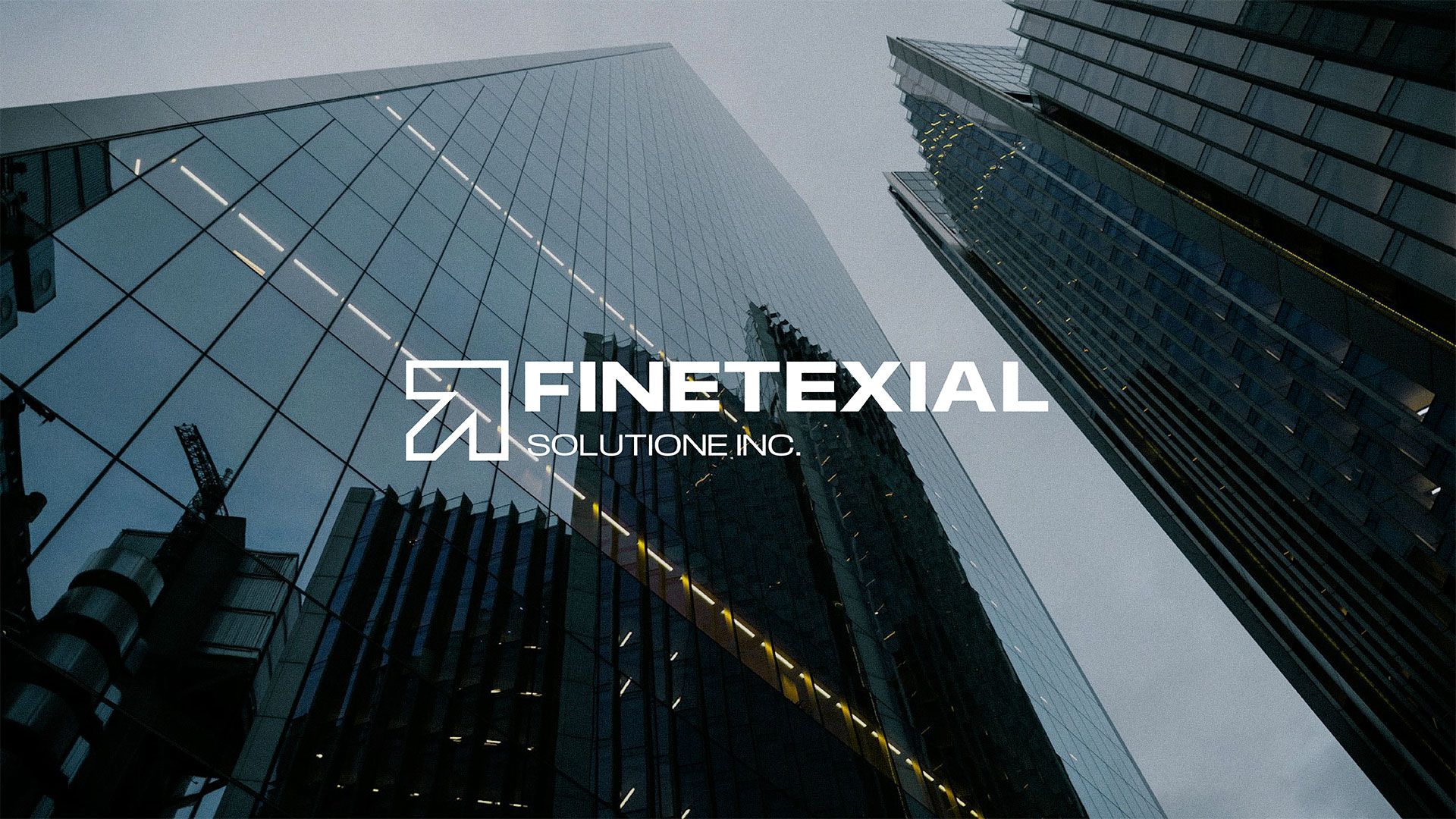
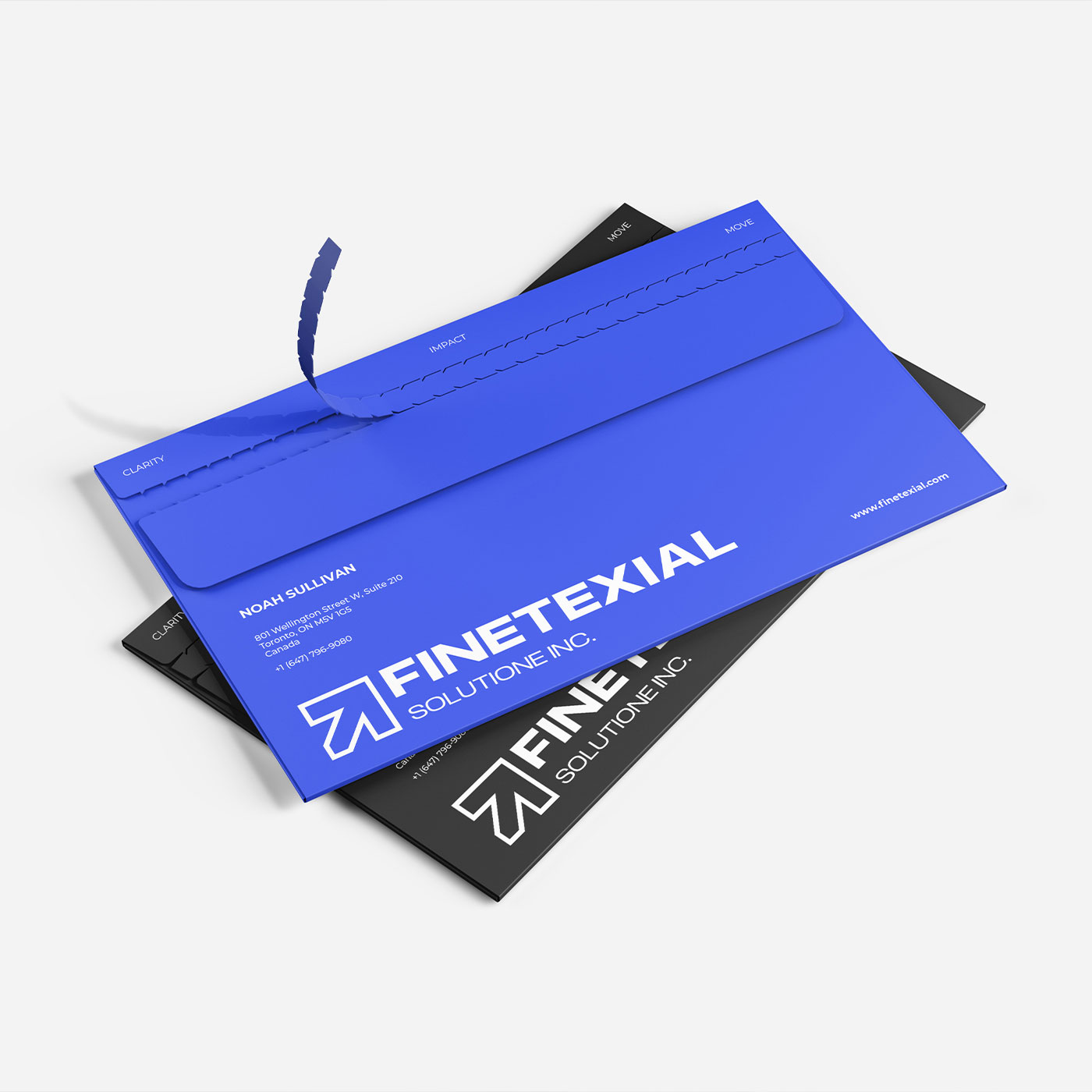
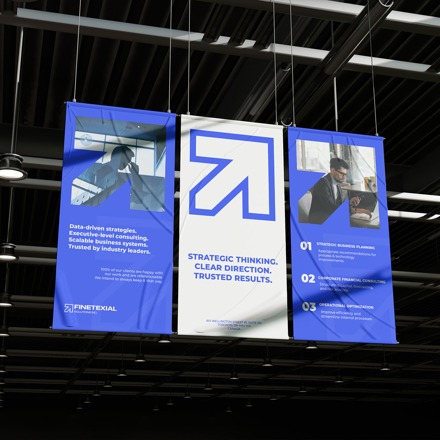
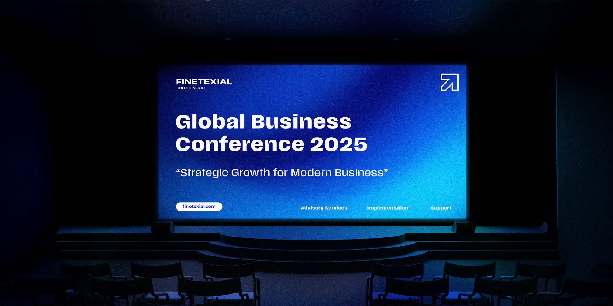
An outlined arrow becomes the defining element of FINETEXIAL's identity. Its upward movement suggests progress, while the wide uppercase wordmark gives the brand a confident, structured presence. The arrow also becomes a graphic device throughout the visual system.
The logo system
One identity, different scales.
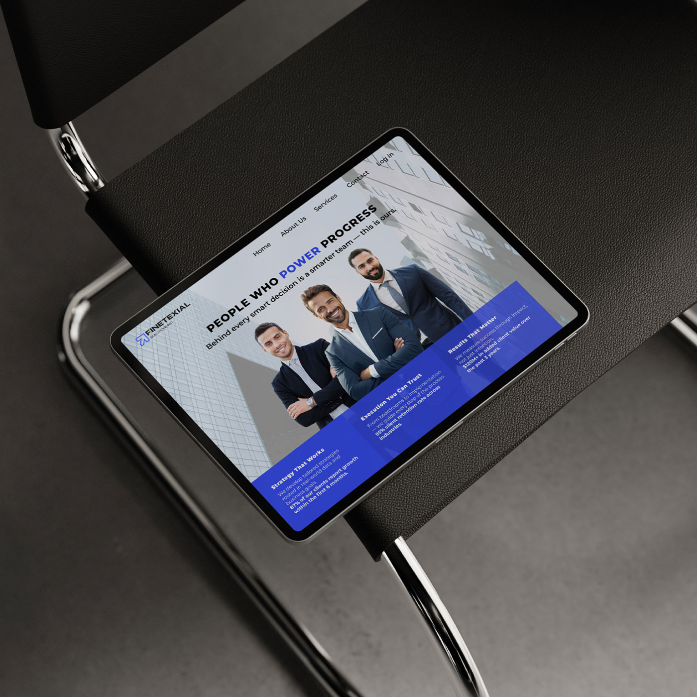
The full wordmark and arrow work together across stationery and branded materials, while the standalone symbol provides a compact alternative for digital applications, including the app icon.
View the full project on Behance