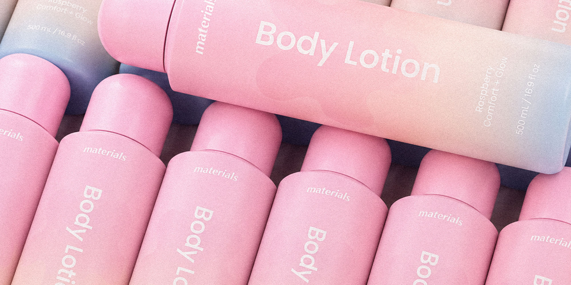
Brand identity · Logo design · Skincare packaging
Materials.
The idea
A softer approach.
A little everyday care.
- The project
- Materials is a skincare brand concept centred on everyday essentials for the face, lips and body, with an emphasis on ingredients and simple daily care.
- My role
- Brand identity & logo design
Skincare packaging design
The visual identity
Soft by nature.
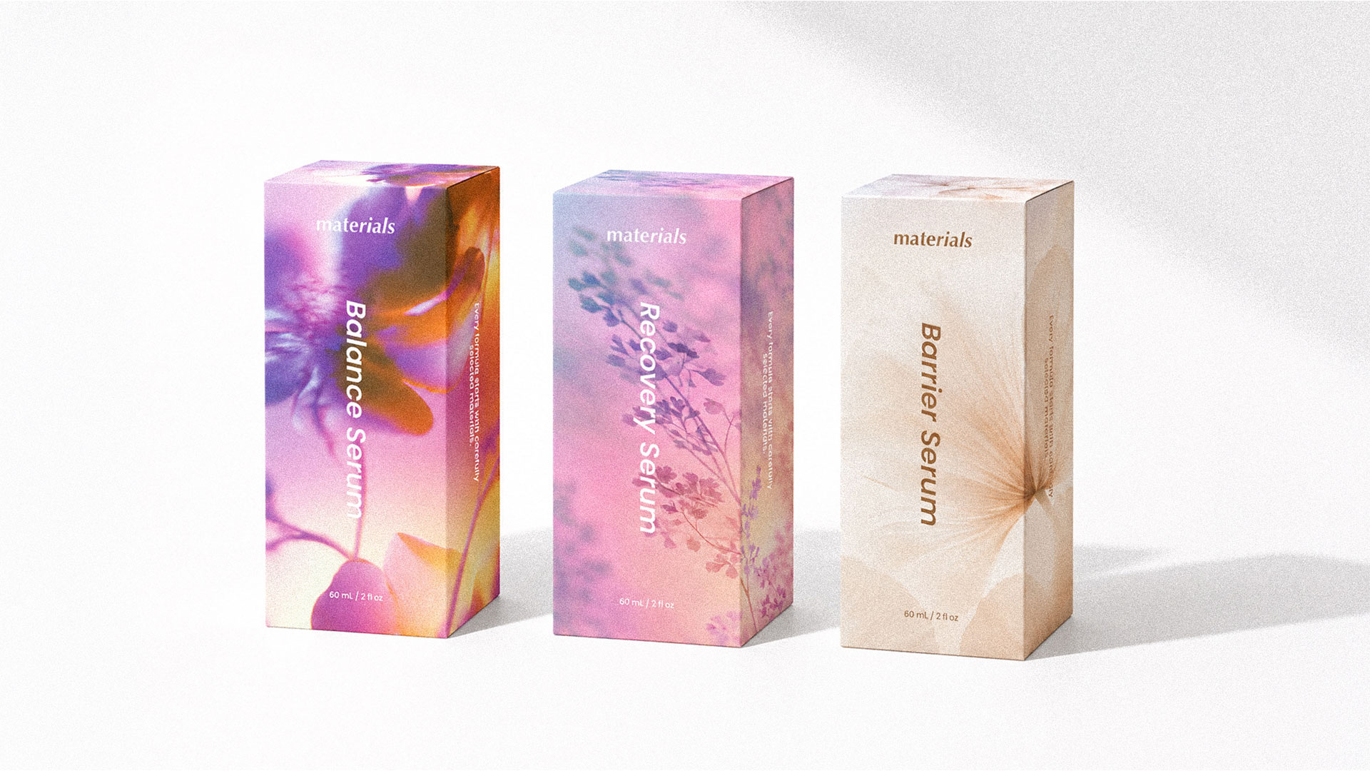
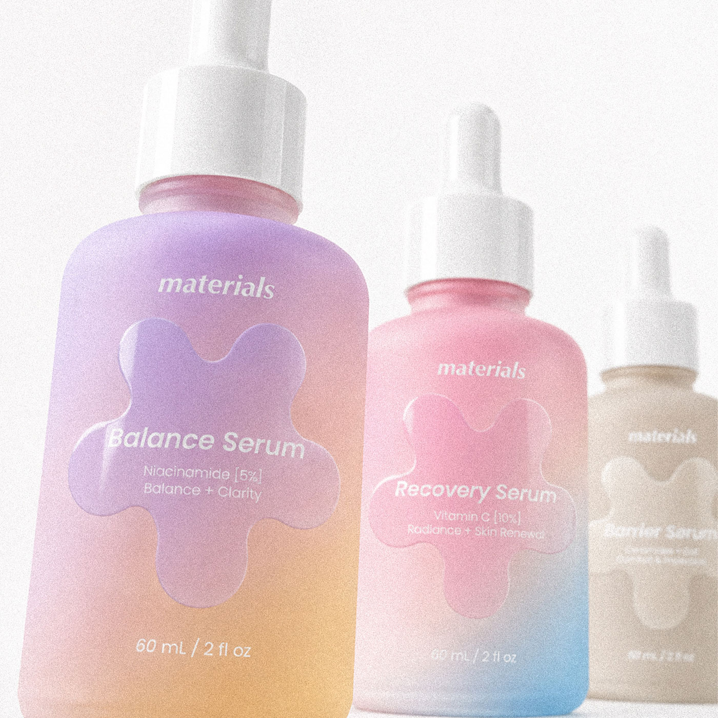
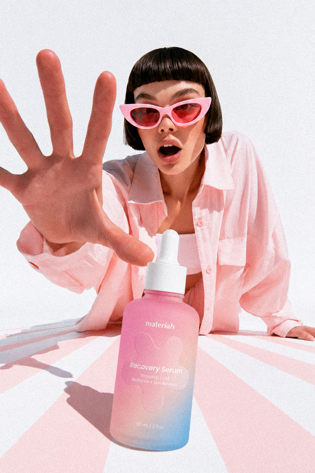
A minimal lowercase wordmark sets the tone for an identity built around softness and simplicity. Delicate floral details, botanical imagery and gentle colour combinations bring warmth to the packaging while keeping product information clear and easy to navigate.
Up close
Small format,
considered details.
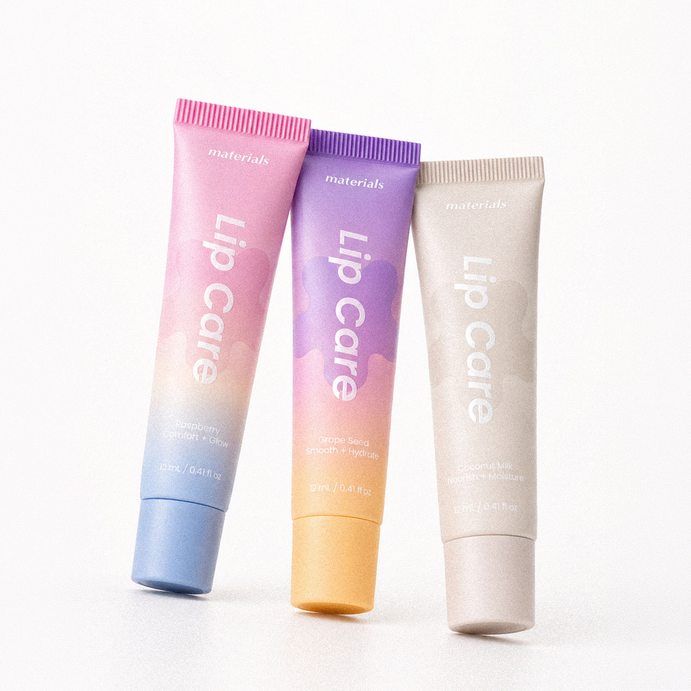
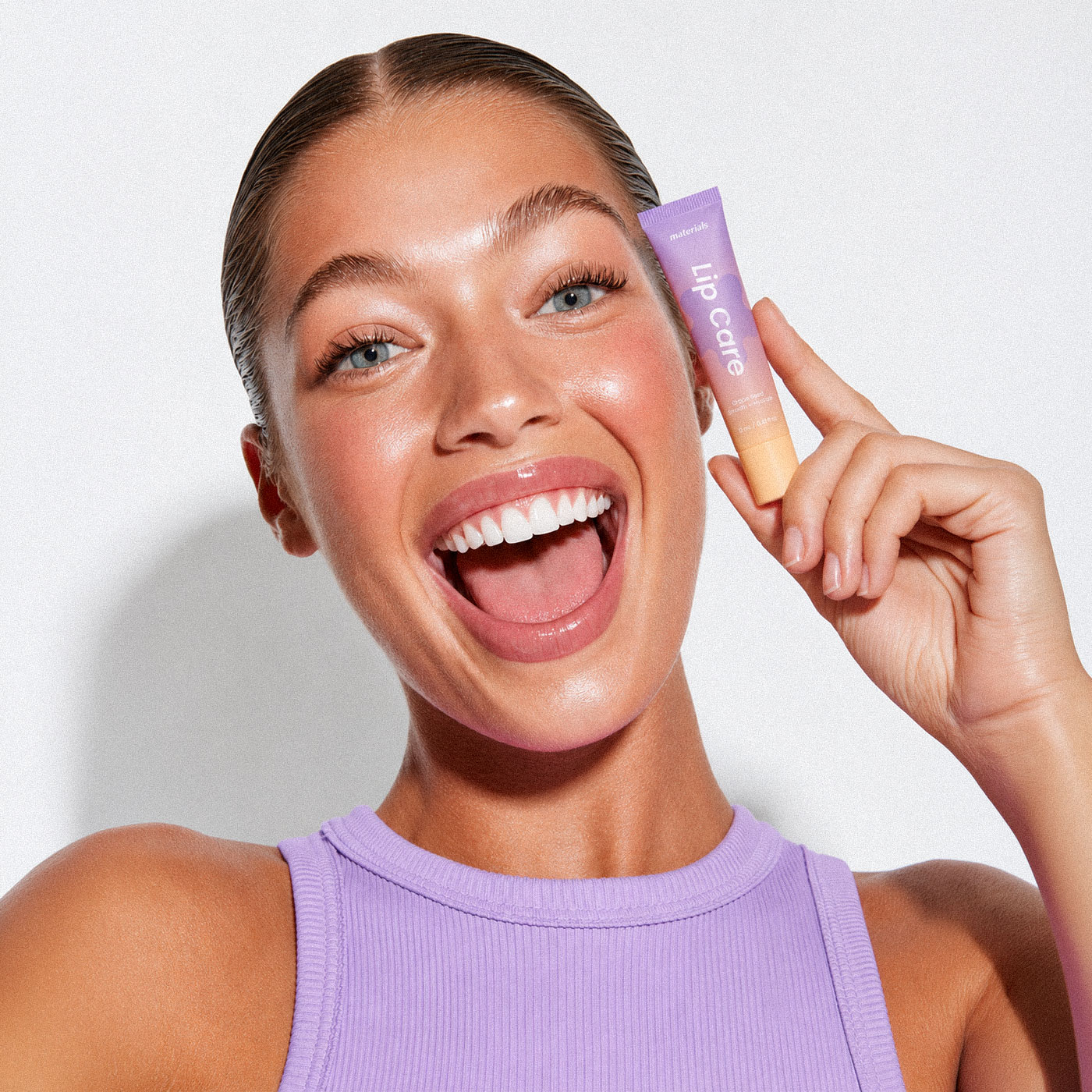
The lip care packaging takes a more compact approach, with vertical typography that makes the most of the narrow tube. Smaller product details are arranged near the cap, keeping the overall design clean and balanced.
The collection
A colour for
every formula.
Raspberry, Grape Seed and Coconut Milk each have a distinct colour palette, repeated across lip care and body lotion packaging. This creates a cohesive collection while making each formula easy to recognise.
View the full project on Behance