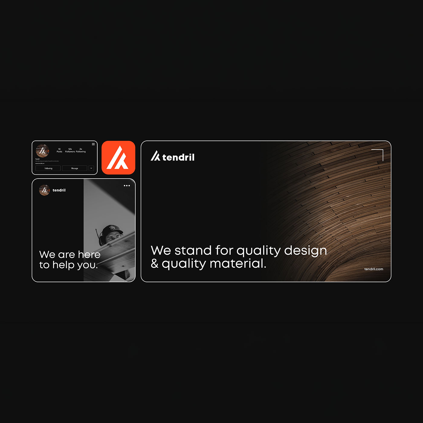
Brand identity · Logo design
TENDRIL.
The idea
An angled mark.
A softer wordmark.
- The project
- TENDRIL is a construction timber supplier working with clients to find wood solutions that meet both the design and practical needs of their projects.
- My role
- Brand identity & logo design
The visual identity
Built on contrast.
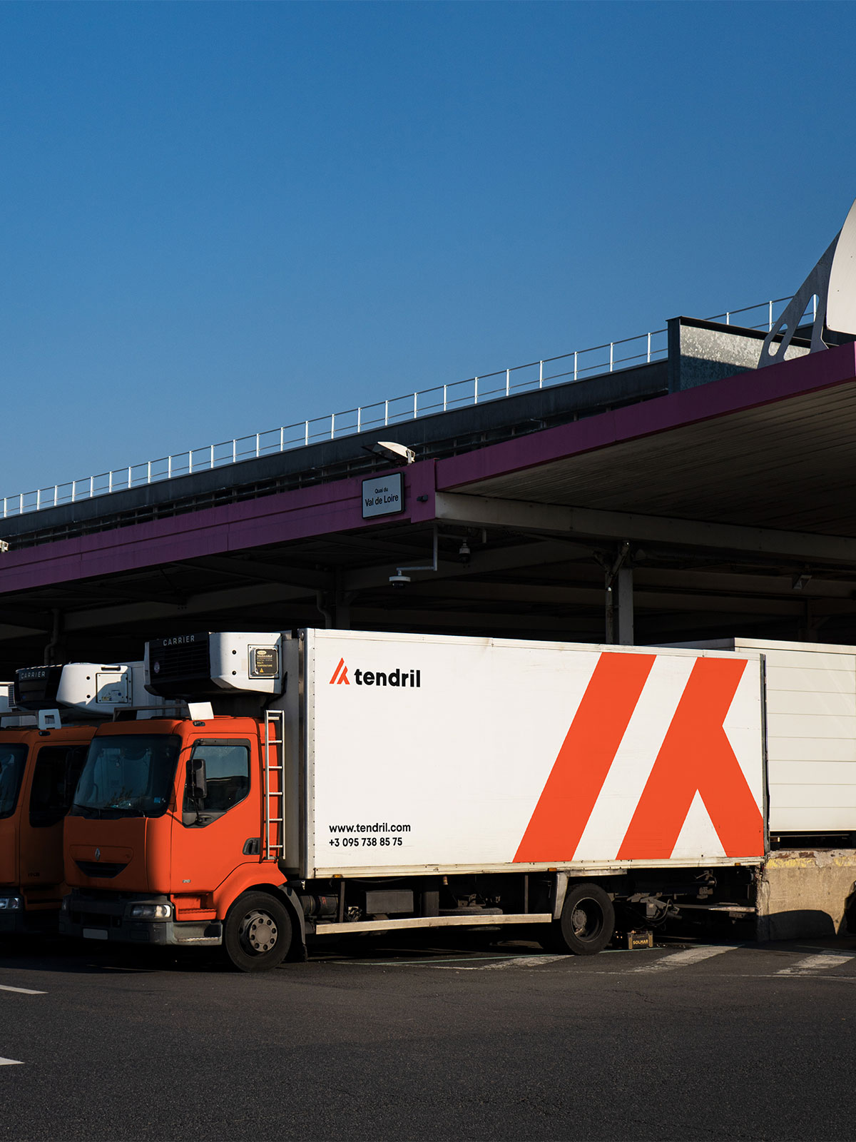
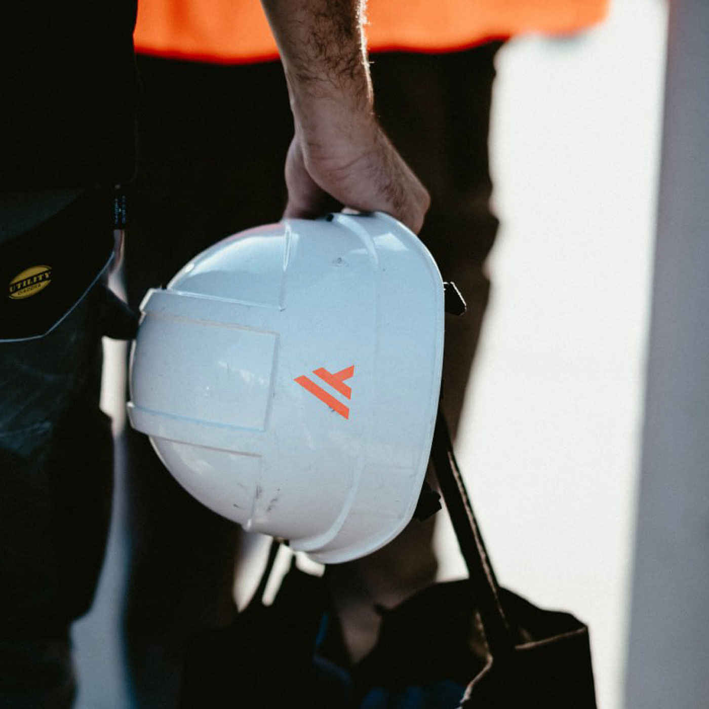
The identity brings together a strong geometric symbol and a softer wordmark, balancing an industrial feel with a more approachable character. The mark is designed to remain recognisable across applications of very different sizes, from hard hats to vehicle graphics.
The logo system
A shape that goes further.
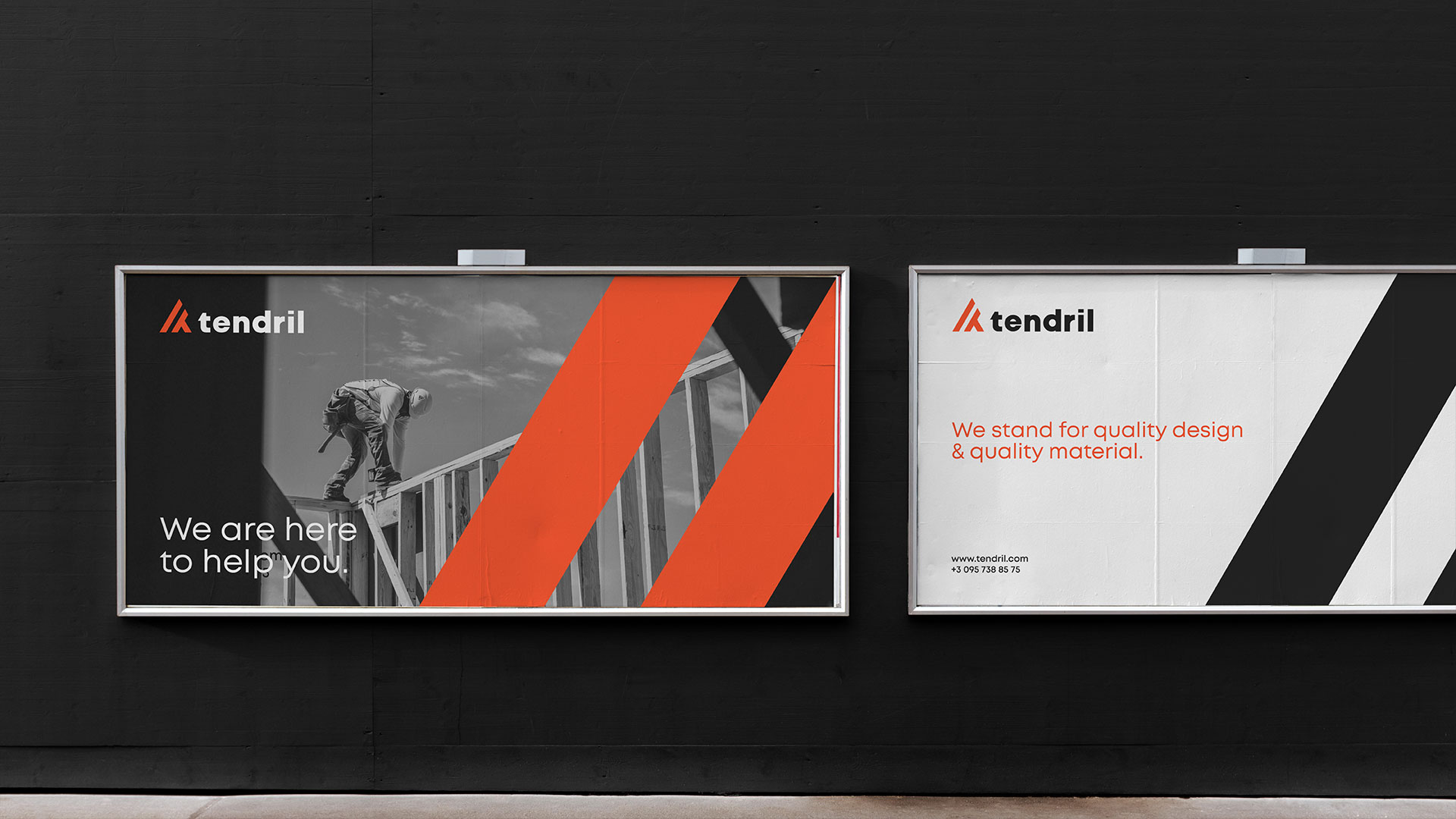
The symbol's diagonal lines extend beyond the logo into the wider identity. They cut through black-and-white construction imagery in vivid orange and reappear as subtle, tonal details on stationery.
View the full project on Behance